MacOS Catalina
Has seen significant changes in macOS in recent years. Last year, for example, macOS Mojave brought a whole new experience to users through dark mode. This year”s macOS Catalina, also has many new bright spots. The emergence of these new features is not only to enable Mac computers to better serve us, but also to strengthen the core competitiveness of Mac computers.
For a long time, Apple’s closed-loop ecology has been recognized by many consumers, and the new macOS Catalina, gives full play to this ecological advantage, bringing a seamless and smooth experience for users.
Split iTunes
If you asked me which update of macOS Catalina was the most obvious, I would say it was iTunes. For the majority of users of Apple products, iTunes should be an “ancient” product. From the earliest iPod era of buying and importing songs to backing up data for iPhone, iTunes carries too many functions. However, iTunes is also a much-criticized software, because its threshold for getting started is really a little high, and the “verbal criticism” of it on the network has never stopped. I think there may be a lot of people who still don’t understand what this iTunes can do.
In fact, if we simplify iTunes, we can see that iTunes is a synchronization assistant + podcast podcast + music purchase platform / player + video player. In iOS and iPadOS, in addition to the synchronization assistant, different App is responsible for each function of iTunes. The simpler logic also reduces the learning cost of users.
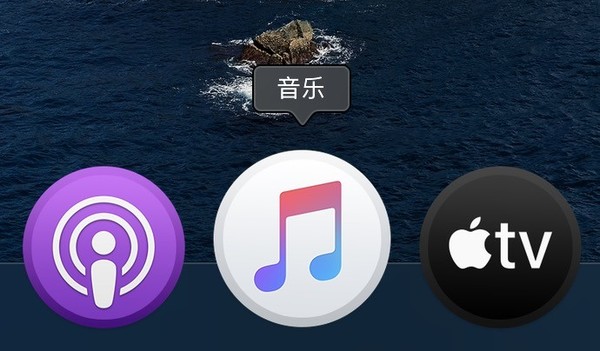
ITunes is split into podcasts, music and video
In macOS Catalina, Apple split the iTunes, and now music, video, podcasts and other functions have corresponding App. Listening to music, watching video and listening to radio can be accessed directly in different App, and the use logic of macOS is finally consistent with mobile devices such as iOS and iPadOS.
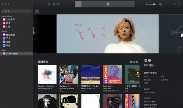
Buy songs in “Music”
Even at a time when Apple Music has been able to meet the needs of the vast majority of users, some consumers still like to buy songs on iTunes. Apple still reserves a channel for us to buy songs this time. If you are using an overseas Apple ID, you can buy your favorite music on iTunes Store.
Of course, if your Apple ID region offers Apple TV+ services that will be launched on November 1st, it can also be used in “video” App.
Some people may ask, my only purpose of opening iTunes is to back up, so now that it is split into three App, where is the backup? In fact, Apple has provided us with a solution that is in line with the logic of daily use, that is, direct backup in the “visit”. When we open the visit, we can see a brand new “storage device” on the side, which is named after our mobile phone name, and we can see all the mobile phone-related information after clicking on it. At the same time, backup data, synchronize mobile phone content, upgrade system and other functions, can be completed directly here.
If you are not used to the complex features in iTunes, then the new backup interface should be approved by you. Because it cancels a lot of modules that have nothing to do with backing up data, the whole interface looks more crisp, and it directly displays the phone as a “mobile storage”, which is also in line with our habitual thinking.
Why does anyone say that they can’t go back after using Apple products?
I think this is inseparable from the close relationship between Apple’s product line. When I want to view the pictures taken by my mobile phone on my computer, I can just click on the picture library on Mac or use Airdrop to solve the problem. When I am at work, the phone has incoming calls, or I can answer it on Mac directly through the “continuous interworking” function. The close linkage between Apple products is enough to make anyone fall in love with the ecology of Apple.
On macOS Cataina, Apple obviously wanted to make this linkage closer, and the new feature “Sidecar” came into being. This feature is designed to use the iPad as the second screen of a Mac computer, but it is much richer in terms of how to play it.
Although the navigation feature is not the exclusive feature of the iPad Pro, and Apple has designed different icon, for different iPad, in order to get the best experience, I still use iPad Pro, to see if the new feature can become a new choice for professionals.
“Follow the Voyage” has two display modes, which are extended mode and mirror mode. The expansion mode is equivalent to providing a second screen for the Mac computer, while the mirror mode displays the contents of the two screens simultaneously.
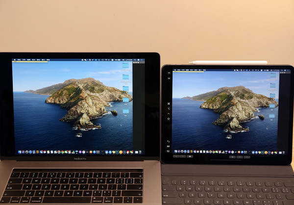
Navigation function
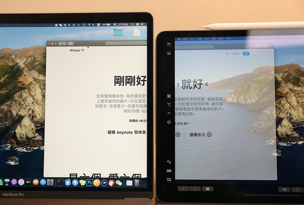
When the expansion mode is turned on, the navigation is divided into three areas on the iPad. The largest of these is the display area, which displays the contents of the second screen. On the left is the shortcut key area, which contains commonly used Mac shortcut keys, including command, option and so on. At the same time, we can also control the rise and fall of the program dock and the switch keypad in this area, which is very rich in functions. As for the bottom, there is the TouchBar area, which allows users to achieve the same quick operation as TouchBar.
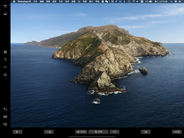
After turning on “follow”, the iPad display is divided into three areas
Of course, the left area and the lower area are also free to adjust. We can adjust the position of the sidebar in the navigation preferences or not even display the sidebar.
If you are a iPad Pro user, I think the follow function will make you fall in love with this productivity tool. First of all, text workers can edit documents directly using iPad Pro’s smart keyboard clip, and the experience is exactly the same as the Mac version. And there is basically no delay in the process of use, and the experience of code words on the table is excellent.
In addition, the navigation feature also supports Apple Pencil for iPad Pro. If you are an expert in drawing, you can turn on mirror mode and use iPad Pro as your digital board. Because Apple Pencil is not only accurate enough to meet daily needs, it also supports the sense of pressure. In some drawing software, iPad Pro can fully meet all the needs of professional users. The
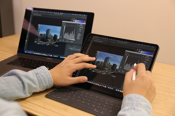
Navigation function supports Apple Pencil
As a new feature, and there is still some room for improvement. For example, the biggest impact on me is the screen resolution.
Because the screen resolution and scale of MacBook Pro and iPad Pro are different, it is often necessary to re-adjust the screen scale when dragging windows from MacBook to iPad Pro. When using mirror mode, there will be some phenomena such as black edge of the screen, insufficient resolution and so on, which are all problems that need to be improved urgently.
On the whole, however, the linkage between macOS and iPadOS is quite successful. Navigation has become a new function of the two systems, and it is a new embodiment of the perfect integration of Apple ecology. Of course, this feature also effectively improves the competitiveness of iPad, and at the same time, it also makes more people realize that iPad is not only a entertainment tool, but also a right-hand man at work. Linkage between
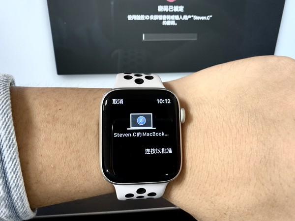
MacOS Catalina and watchOS
In addition to the linkage between macOS and iPadOS, the macOS Catalina also has a new linkage with watchOS. Now Apple Watch can not only unlock Mac, when you wear it, but also serve as an entirely new means of verification. For example, when we open a Safari browser, we can double-click the button below the digital crown to verify it, eliminating the process of entering the password. It is not difficult to see that this is also an example of the perfect ecological integration of Apple.
Some small surprises
In macOS Catalina, there are still many details worthy of our attention. First of all, the acclaimed “screen usage time” in iOS came to macOS. We can see where our time is spent here, and we can also control the opening time of App through the quota. However, the calculation of screen usage time is still a little confusing to me, because as long as the app hangs in the background, the screen display time will think that you are using this App. This causes some App that I have never used and only displays in the background to appear in the screen usage time.
But considering that many times the feature also includes parent-specific features such as “limited communication” and “merge quota”, it should also be laudable that the screen display time comes to macOS to make it easier for parents to manage Mac computers.
In iOS 13, “Find My iPhone” has been upgraded to “find”, macOS Catalina. In a nutshell, the new search is to integrate “find my XX” with “find my friends” in the past. The app can find not only devices, but also your contacts. And surprisingly, finding devices doesn’t need to be connected to the network. Because the new search function allows the device to send out a Bluetooth signal, the signal can be searched by other Apple devices nearby, so that the approximate location of the located device can be found through other devices.

“Find” App
With this feature, the probability of losing an Apple device should be greatly reduced, even if it is stolen, the probability of recovery will be greatly improved.
Some people may be worried that the search feature may have the risk of privacy disclosure, but Apple also made a clear explanation on the page to dispel people’s doubts: “the whole process is completely anonymous and protected by end-to-end encryption, so no one, including Apple, can know the identity of the reporting device. At the same time, reporting is carried out quietly and takes up only a very small amount of data in current network traffic, so you don’t have to worry about battery life, data usage and privacy. “
Expectations for macOS Catalina
At this year’s WWDC conference, Apple brought the Mac Catalyst program to developers. The program allows developers to easily transfer iPad’s App to Mac, with only a small amount of code to allow iPad applications to run on Mac.
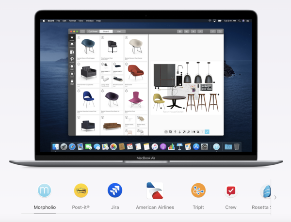
Use iPad’s App
On Mac. In fact, this is also a major feature of macOS Catalina. Apple officials also said that App such as Asphalt 9, DC Universe, Morpholio and Jira will be launched on AppStore one after another. But so far, I haven’t found these App, in the app store. I have to wait for developers to get on the shelves as soon as possible.
In fact, for developers, participating in the Mac Catalyst program is very cost-effective. Because Apple has provided a very good platform, developers can use a set of code on both platforms at the same time, which not only saves developers’ time, but also allows users to have a more unified experience, which is definitely a good thing.
However, considering the different ways in which iPad and Mac interact, how to balance the experience of the two is clearly a question for developers to think about. Because the mode of operation of the touch screen is still very different from that of the keyboard and mouse, and there is not a large productivity software that can successfully achieve dual-platform compatibility, we are still looking forward to having a guide to provide us with a more perfect development direction. Will the guide of be Apple itself? I can’t give an accurate answer. However, I believe that in the future, with the continuous running-in of macOS and iPadOS, we will eventually see a device with a better experience, which will also let more users understand the charm of Apple’s ecology.


